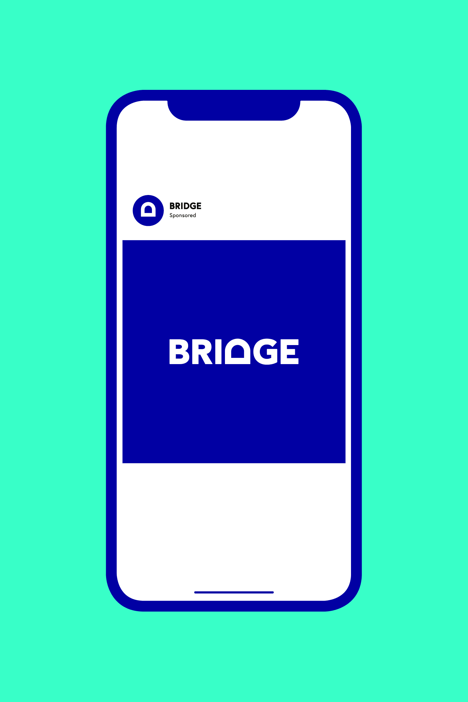
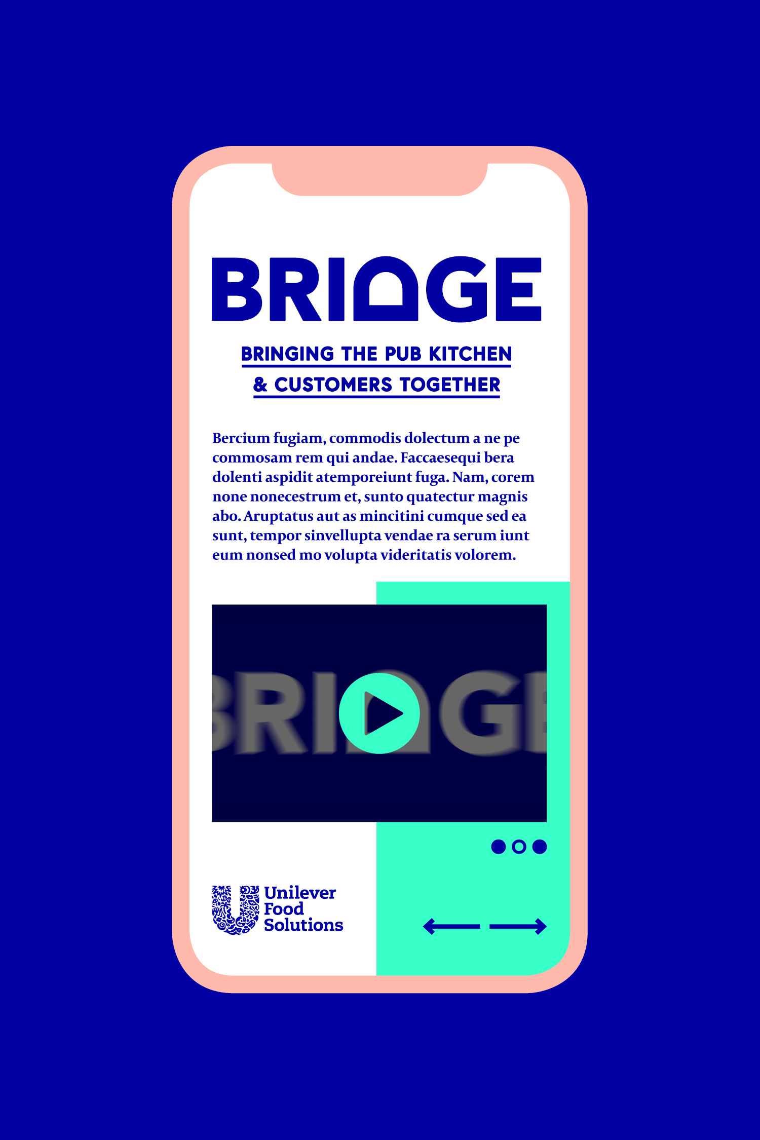
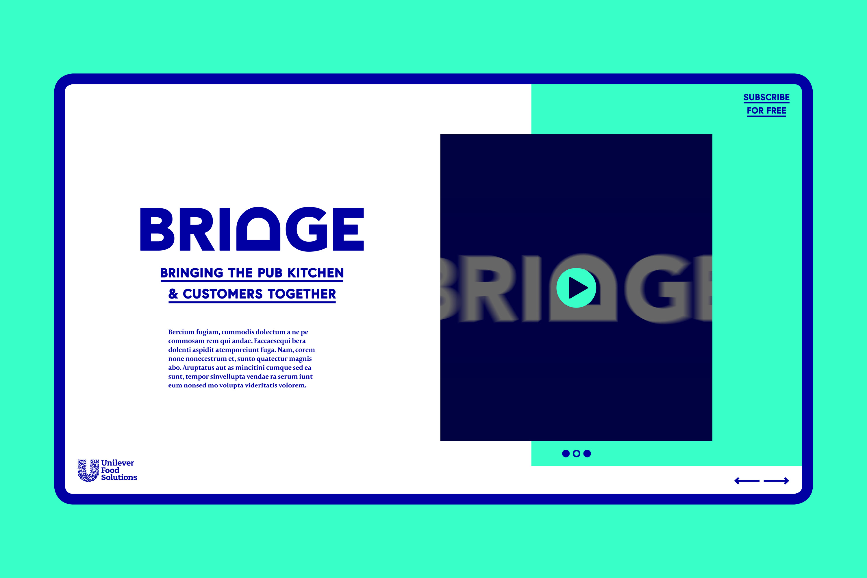
Bridge
Bridge
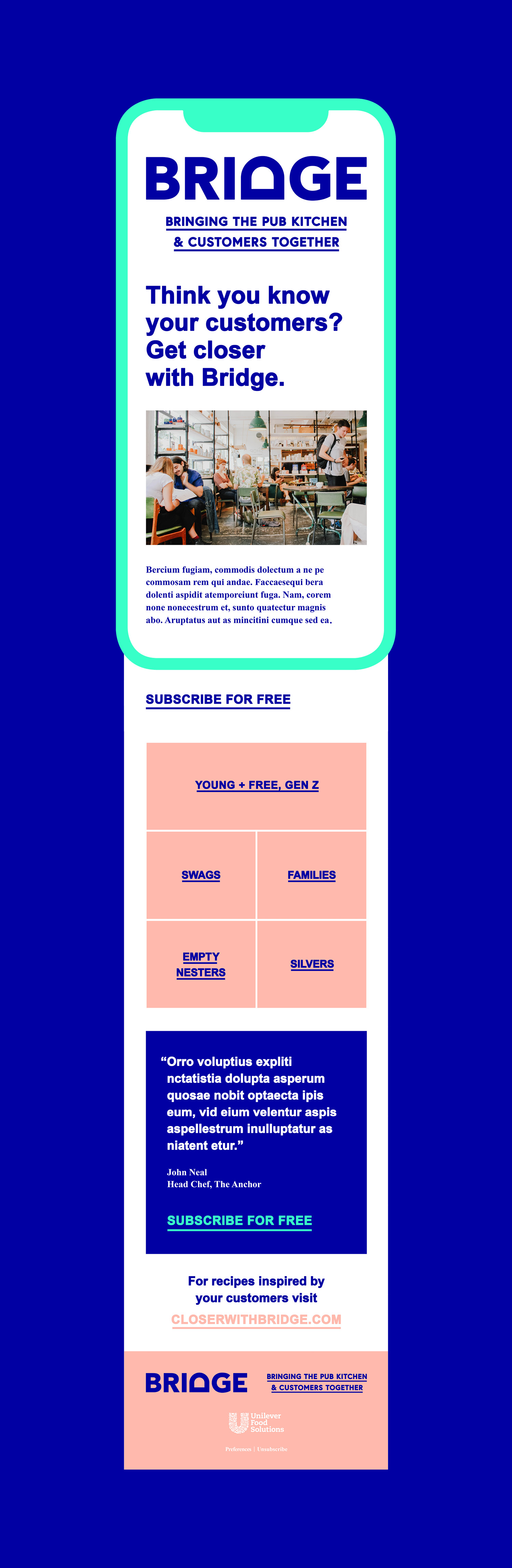
A digital marketing campaign that helps the pub kitchen get closer to customers.
Creative
Campaign
Digital magazine
Creative
Campaign
Digital magazine
Creative
Campaign
Digital magazine
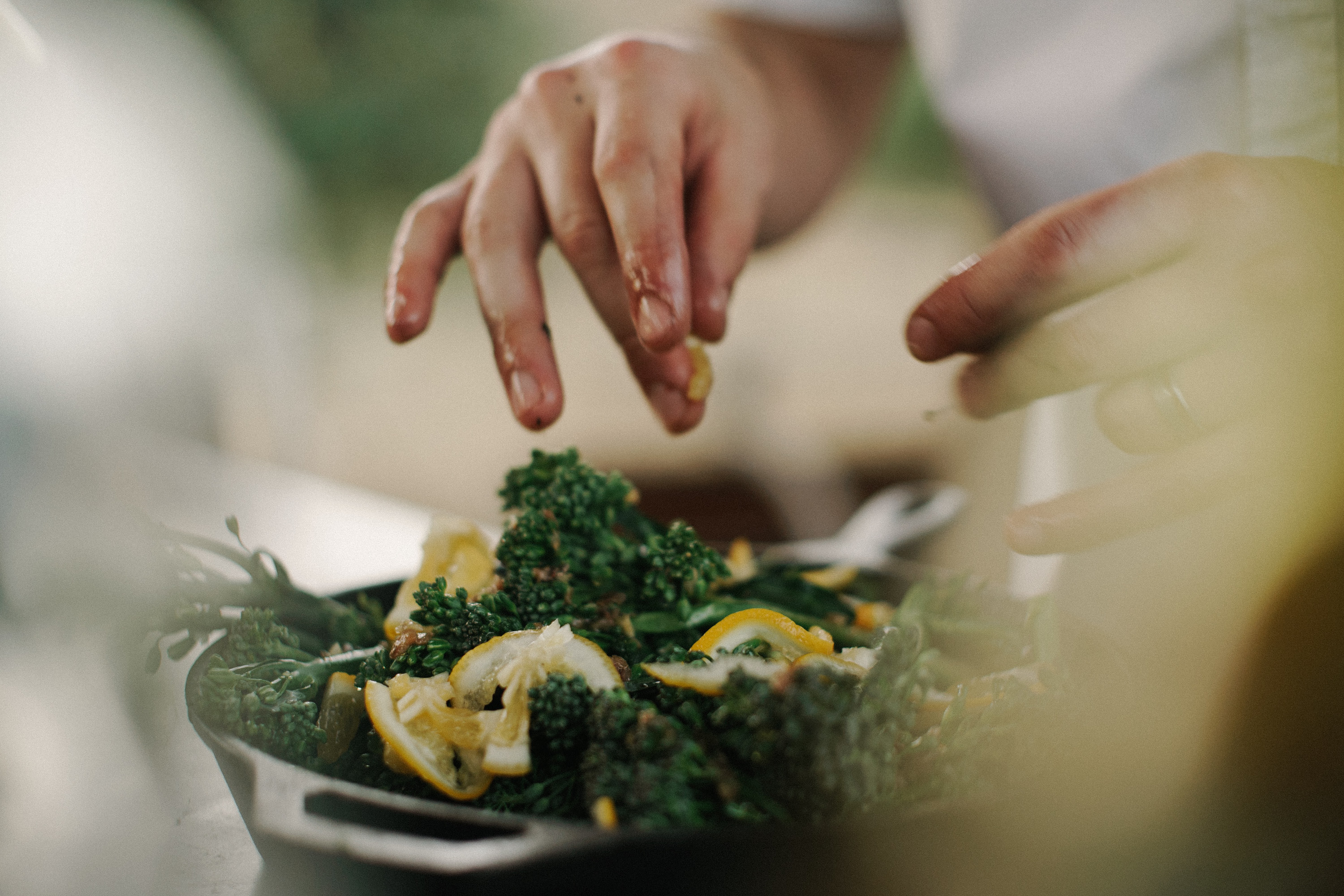
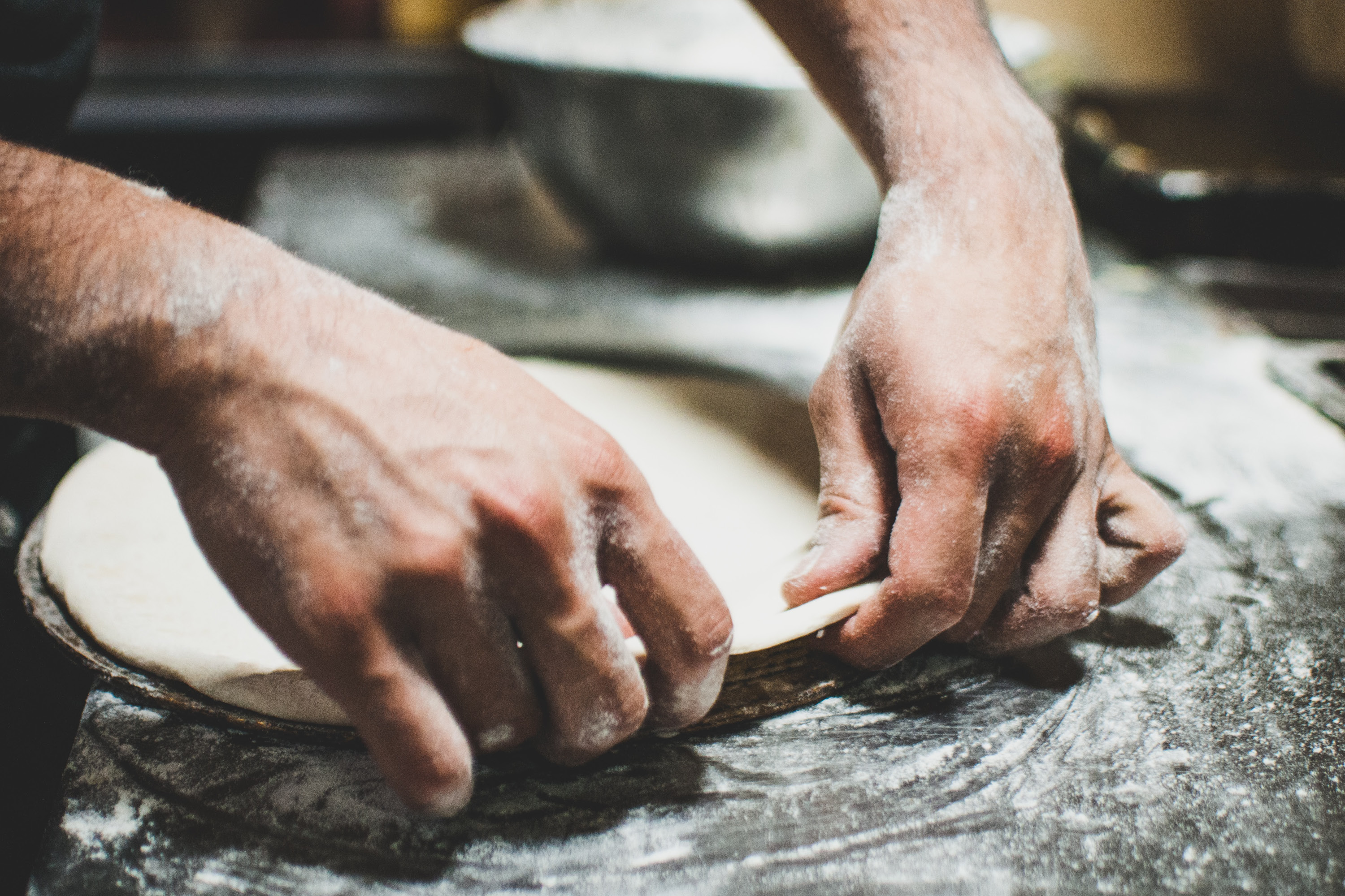
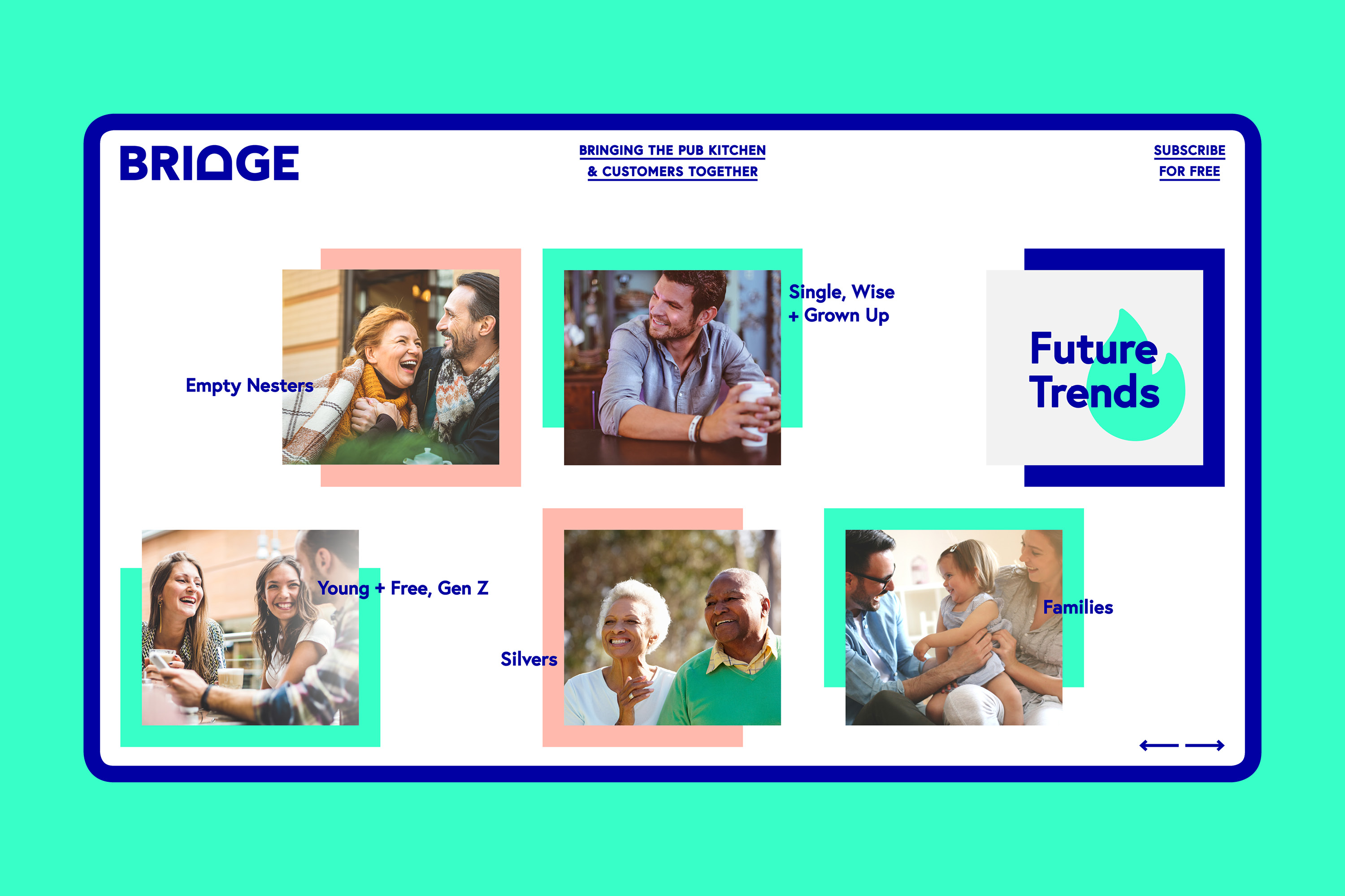
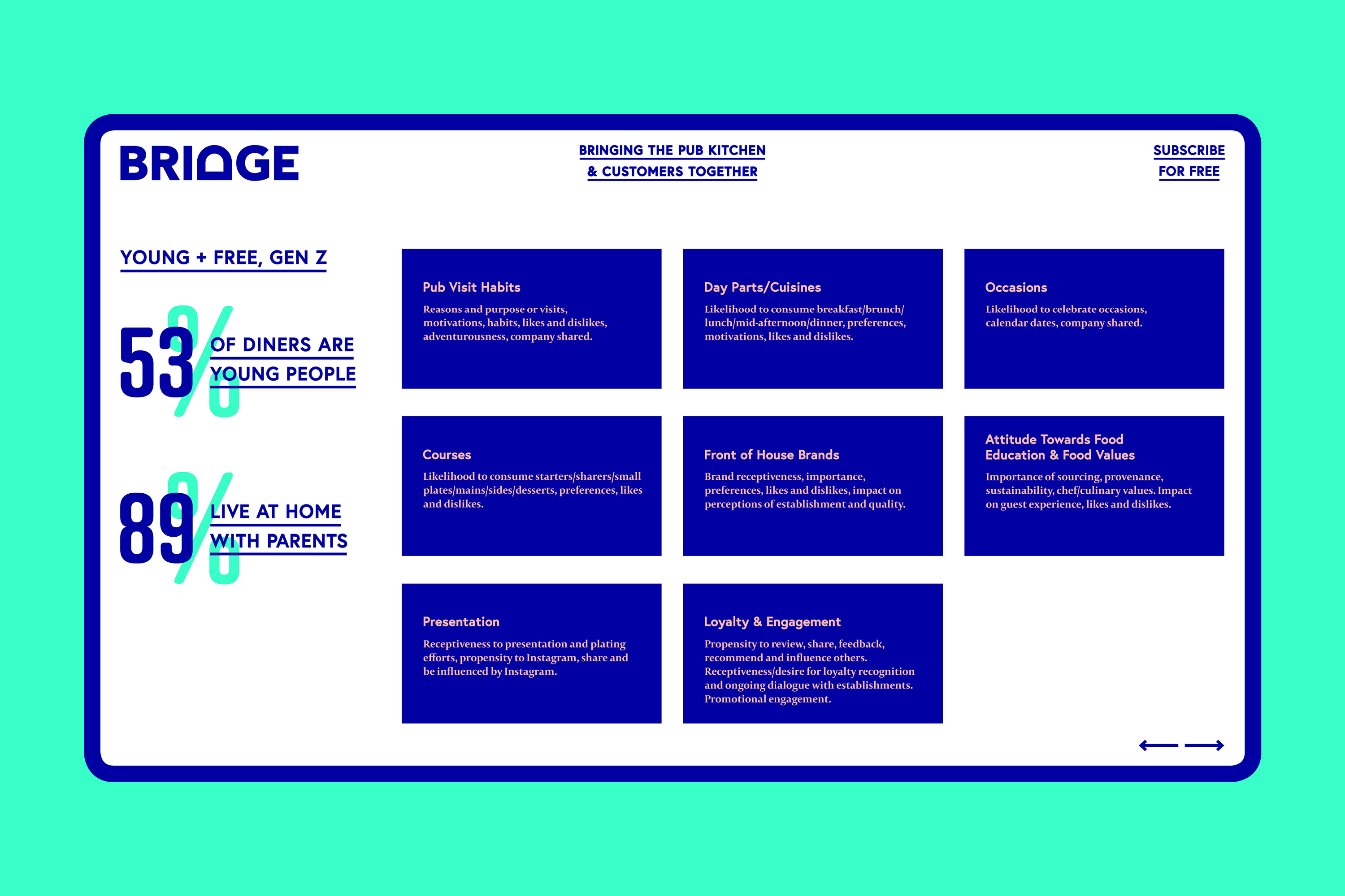
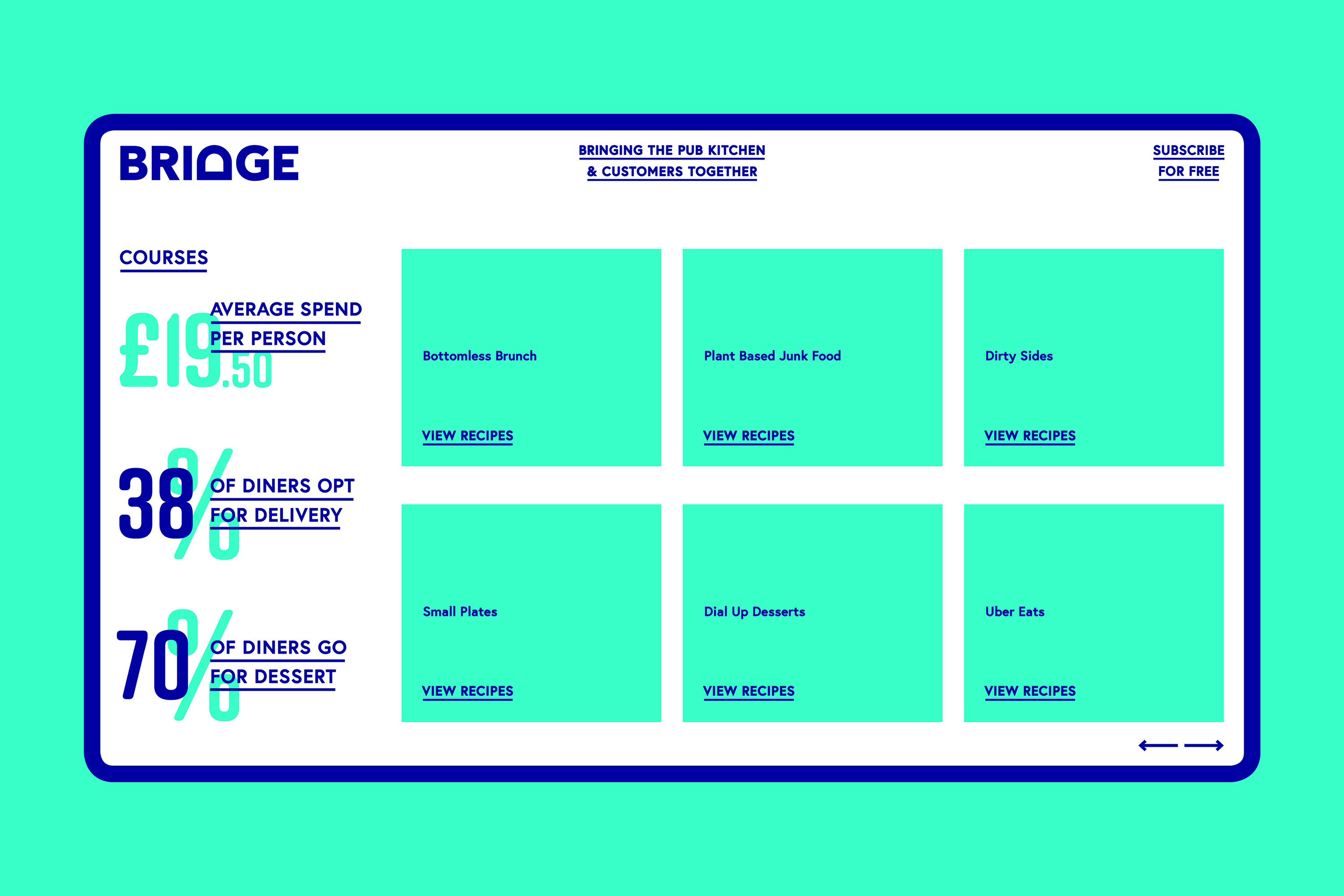
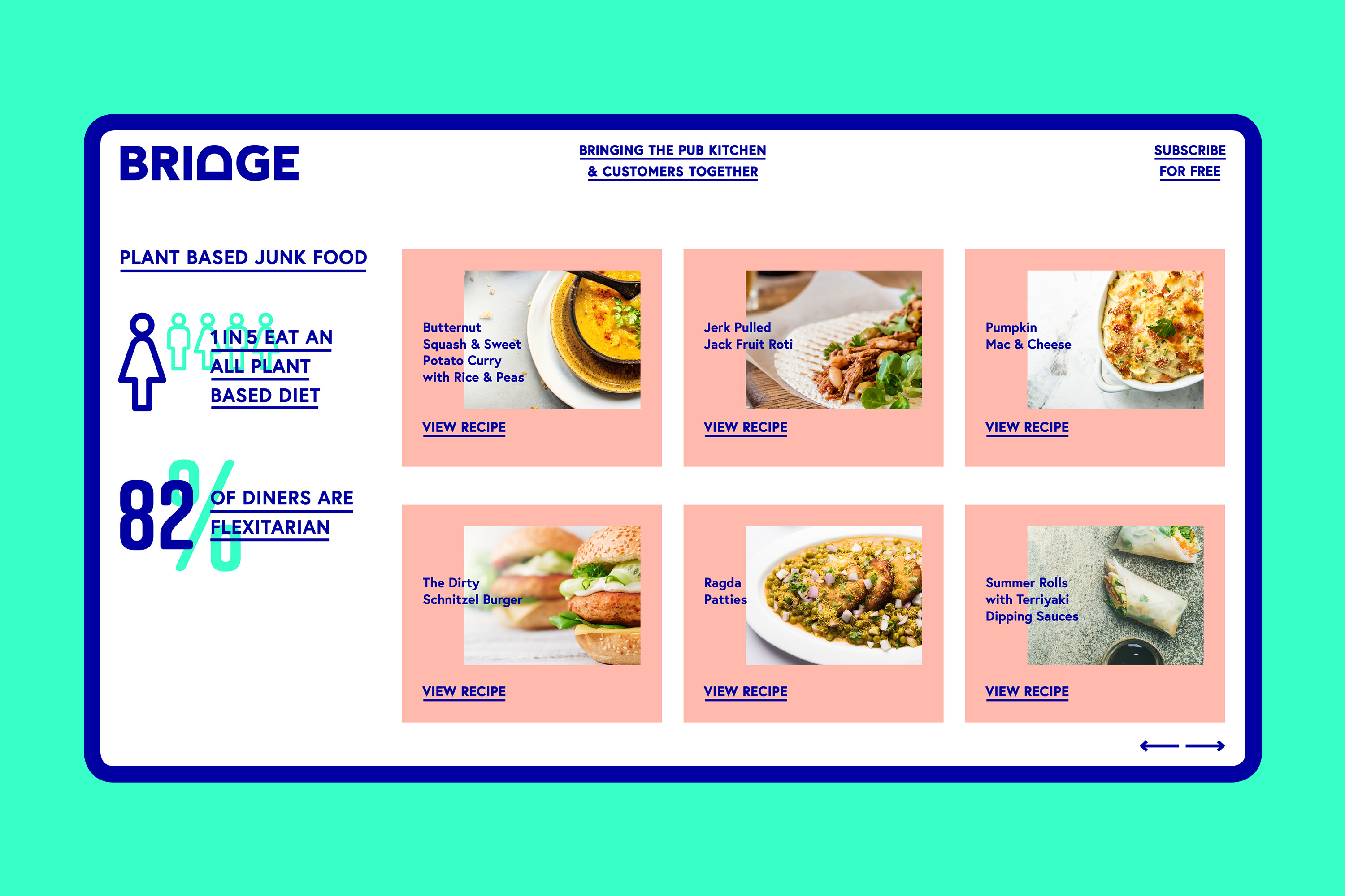
Unilever approached us to create a brand that would help pub chefs gain knowledge across food trends, menu inspiration and diner eating habits.
The brand marque is uncomplicated and literal in it's approach, turning the letter D on it's back to form a bridge. The tone of voice is straight talking, yet approachable. Colours have been carefully selected, pink to symbolise caring and unification, blue for trust and honesty and teal for growth and harmony. All key values which Bridge stands for.
We opted for a digital only solution, chefs are limited on time and we wanted to approach them in most time efficient way. Email and social media campaigns were created alongside a digital magazine. With food trends always evolving this insured content would remain fresh at all times.
Agency credit – Foodsmiths